
Top Neutral Paint Colors That Don’t Feel Boring (2025 Edition)
Warm, timeless and perfect for Kansas City homes. Discover the best neutral paint colors for 2025, aka the best warm neutrals, greiges, and cozy tones that make Kansas City homes feel fresh and timeless. Explore our favorite Sherwin-Williams and Benjamin Moore neutrals that don’t feel beige or boring.
Neutrals Are Back (and Better Than Ever)
For a while, everyone was chasing bold accent walls and deep color trends, but in 2025, neutral paint colors have made a comeback in a big way. Pinterest searches for “warm neutral paint colors” and “neutral wall color ideas” are at an all-time high, and for good reason.
Neutrals create calm, cozy spaces that still feel polished. They pair beautifully with wood tones, black windows, or brushed brass hardware, which we see often in our Kansas City remodels. Whether you’re refreshing one room or remodeling your whole home, a neutral palette is one of the easiest ways to make your space feel both current and timeless.
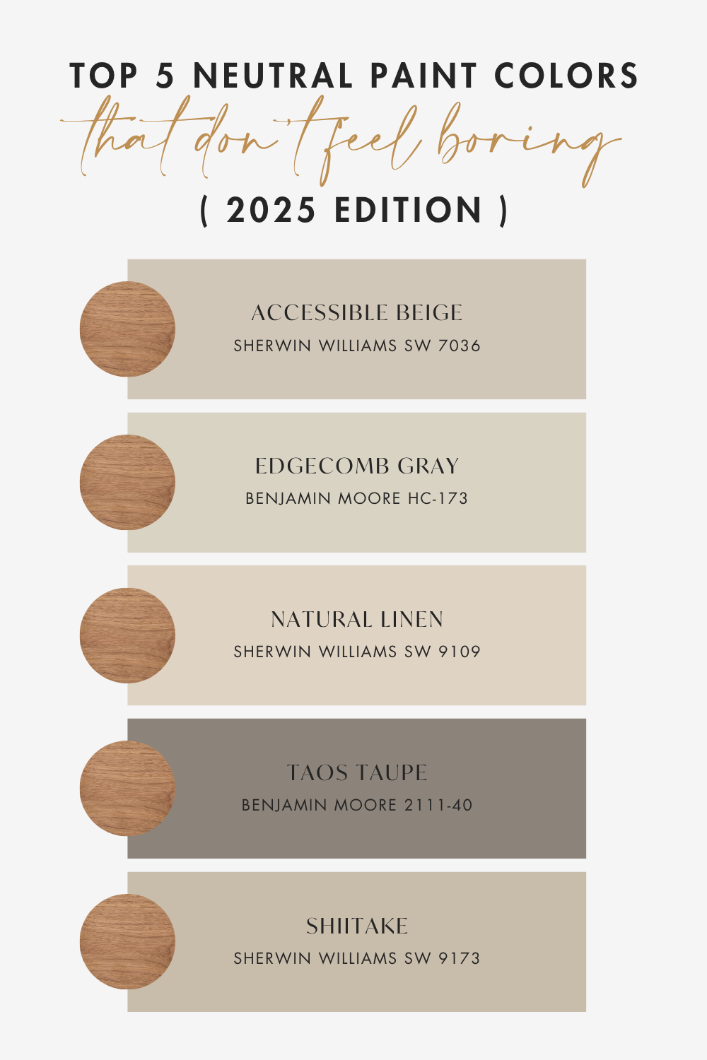
The Best Warm Neutral Paint Colors (That Don’t Feel Beige)
Forget the flat “builder beige” from the early 2000s. Today’s neutrals are rich, layered, and full of warmth. Here are a few tried-and-true favorites from our Kansas City remodeling projects:
1. Sherwin-Williams Accessible Beige (SW 7036)
A longtime favorite, this greige strikes the perfect balance between warm and cool. It looks sophisticated against white trim or black windows, perfect for open-concept homes.
2. Benjamin Moore Edgecomb Gray (HC-173)
An incredible neutral paint color that feels elegant and grounded. It’s soft enough for bedrooms and bright enough for living areas.
3. Sherwin-Williams Natural Linen (SW 9109)
For homes with oak or warmer wood tones, Natural Linen is a beautiful choice. It keeps the warmth without feeling yellow, a common issue in Kansas City homes with honey oak trim.
4. Benjamin Moore Taos Taupe (2111-40)
A rich, warm neutral that gives historic vibes while still feeling contemporary and relevant. We love this for mudrooms, bathrooms, or small spaces that need some warmth.
5. Sherwin Williams Shiitake (SW 9173)
This warm stone beige evokes a sense of calm and comfort. Bonus points if you color drench. This is one of our favorite colors of 2025.
Trending Neutrals with Personality
According to Pinterest’s 2025 color forecast, neutrals are shifting toward earthier, moodier undertones, think sand, clay, mushroom, and oatmeal tones. Colors like Sherwin-Williams Drift of Mist, Benjamin Moore Balboa Mist, and Pinterest’s trending shade Alpine Oat are redefining what “neutral” means.
These “new neutrals” add just enough depth to feel intentional, perfect for homeowners who want calm spaces that still have character.
Use them with natural textures like rattan, linen, and stone for a warm, organic look that’s right on trend.
How to Choose the Right Neutral for Your Home
When we help our Lee’s Summit and Kansas City remodel clients select paint colors, we always look at:
Lighting: North-facing rooms often need warmer tones; south-facing can handle cooler neutrals. Also be careful of bulbs that read “yellow.”
Fixed Finishes: Your flooring, countertops, and trim tones matter more than you think.
Undertones: Some neutrals lean pink, green, or yellow… test samples on your wall and next to your existing finishes before committing.
Pro tip: Paint large samples on white poster board and move them around your space throughout the day. Lighting shifts everything!
Local Tip: Kansas City Homes Love Warm Neutrals
Between our area’s four seasons and mix of traditional and modern architecture, warm neutrals are an easy win for Kansas City homeowners. They complement everything from honey oak trim in older homes to the white oak cabinetry and black-framed windows we’re seeing in newer builds.
A warm neutral paint color creates the perfect backdrop for layered textures, cozy lighting, and family life, without ever feeling sterile.
Pinterest-Worthy Pairings
Want to make your neutrals pop? Try pairing your paint color with:
Bold black accents (used sparingly, matte black pottery or accents)
Brass lights, knobs & pulls (really pops with these colors)
Natural materials (wood, stone, and woven textures)
Greige and white combinations (timeless and swoon-worthy)
Greenery (plants look amazing against neutral walls)
Final Thoughts
If you’re looking for a paint color that will stand the test of time, warm neutral paint colors are the easiest way to refresh your home — and they’re trending everywhere right now.
From Benjamin Moore neutrals to Sherwin-Williams greiges, these shades are perfect for Kansas City homes that want a cozy, classic foundation that still feels elevated.
If you loved this post, check out our post about Paint Colors That Go With Honey Oak, and Steal Our Top 5 Green Paint Colors.
Ready to start your remodel? Haven Reno KC is here to help you design and transform your home — from color selection to full remodel planning. Contact us now for a free estimate!